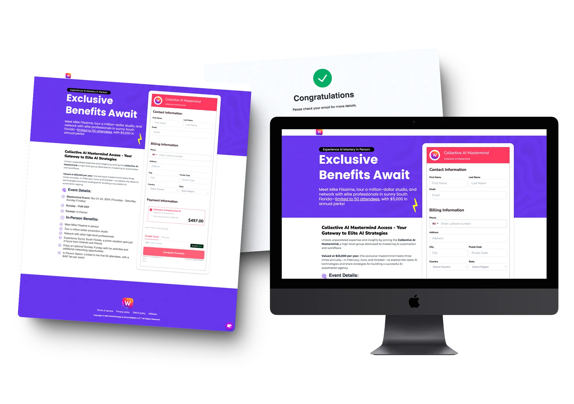
Phase 1 Success: Checkout Page Design for WorkflowApp Mastermind | LuDesign
At LuDesign, we pride ourselves on delivering high-conversion, user-friendly web pages that blend functionality and style. Recently, we completed Phase 1 of the WorkflowApp Mastermind checkout page—a streamlined solution built for efficiency and maximum customer engagement.
Headline and Sub-headline Copy for Maximum Impact
Our design for the checkout page begins with crisp and compelling headline and sub-headline copy. These elements are crafted to immediately grab attention and encourage users to complete their purchase with confidence. Every word has been strategically chosen to resonate with the target audience, ensuring the copy is clear and engaging.
Clean Design with Animated Elements
Simplicity meets sophistication in the overall design. The checkout form is located on the right side of the page, while the left side features clean, animated elements that guide users effortlessly through the purchasing process. Animation is subtly used to enhance visual engagement without distracting from the user experience. This design choice keeps visitors focused on what matters—completing their purchase.

GrooveSell Product Setup
In addition to the checkout page, we handled the entire GrooveSell product setup. Here’s a breakdown of what we achieved:
- Product Definition: We added all essential product details, pricing structures, and descriptions within GrooveSell to ensure accuracy.
- Payment Gateway Integration: Stripe was integrated into the checkout process to provide a seamless, secure, and reliable payment experience.
- Checkout Recap: The checkout process includes a checkout recap page, providing users a summary of their order before completing their purchase. This helps eliminate confusion and ensures accuracy.
- Thank You Page: Once the purchase is complete, users are redirected to a personalized Thank You Page. This page serves not only as a confirmation of purchase but also provides the next steps or additional instructions.
What's Next?
This is only Phase 1 of the WorkflowApp Mastermind checkout page. As we gather reviews and user feedback, we'll be implementing further refinements to optimize performance ahead of the official launch. Future updates will focus on enhancing customer experience, streamlining the flow, and adding new features.
At LuDesign, we believe in continuously improving to achieve the best results for our clients. Whether it's crafting compelling headline copy, designing a checkout page, or setting up products in GrooveSell, our team ensures every detail is covered.
Conclusion
Our work for WorkflowApp Mastermind’s checkout page is just the beginning. Stay tuned for further updates as we continue to optimize and refine this page for its official launch. If you're looking to create a conversion-focused checkout experience, let LuDesign help you bring your vision to life. Reach out to us today!
